
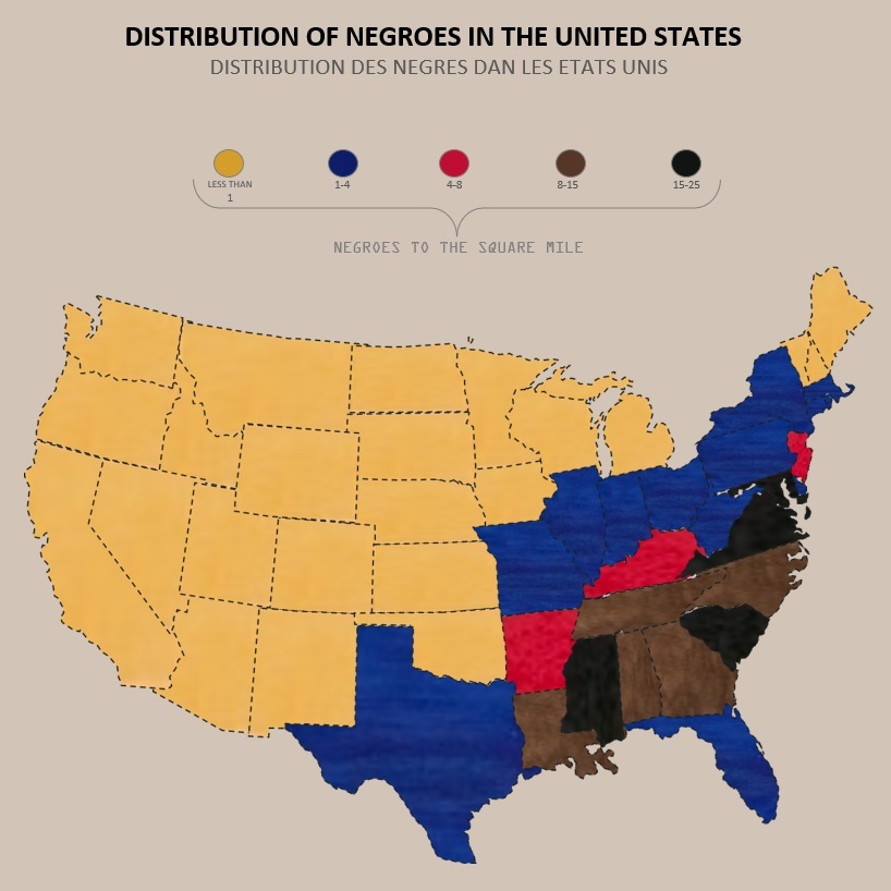
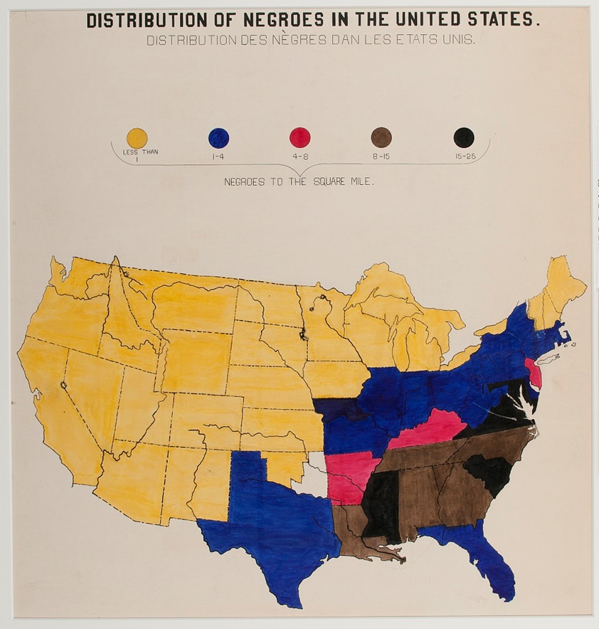
Distribution of Negroes in the United States
Recreating a powerful historical visualization by W. E. B. Du Bois 📊
This map shows the distribution of Black Americans across the United States at the turn of the 20th century, measured by population density per square mile. The contrast is striking — from less than 1 person per square mile in the West to some of the highest densities in the Deep South.
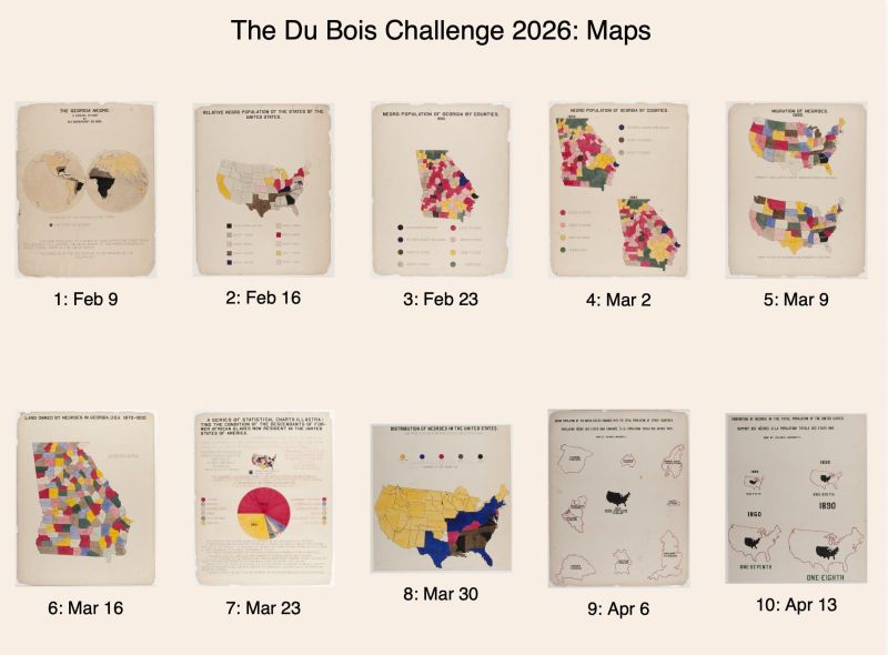
Rebuilt in Excel as part of the Du Bois Challenge, this piece highlights how data visualization has long been a tool for storytelling, awareness, and social insight.
Version: 1.0.0
Requirements: Excel 2016
Macros: not used
The analysis template is completely open and available for public use. It does not contain macros, all interactive functionality is implemented using formulas.
